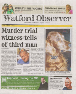
The Harrow Observer local newspaper follows many of the codes and conventions of typical local newspapers, for example the title spans across the length of the page, is a convention of most newspapers since the title needs to stand out when on the shelf visible for the market to see. The strap line has the date and price of the newspaper two things the buyer would want to know about the paper, it also has the newspapers website on the strap line to link the print version and the web version.
The columns in the Watford Observer seem poorly done, as two of the columns are split by the awkwardly placed picture, the header of the story is set to the left and would look much more pleasing if it were set in the middle above the story, the caption is also set to the left and would be a lot better centred under the picture. There is a rule of thirds with the two columns and the dog slightly broken by the picture of the man.
The picture of the dog is strangely larger than the other three pictures of men, implying the dog is more important than a man who committed suicide; the suicide story is in such a small box in the bottom right it would be easy to miss and isn’t portrayed as anything too serious, even though he lost his life. The Photoshop cut out of the man’s head is very poor as you can see excess lines around his hair which were not cropped: the picture of the dog also has its nose
cropped out from view, so it looks poorly framed on the page.
At the bottom left there is an advert for a local MP, the advert relates to people in the local area of Watford, as they may know him or of him, this helps the reader feel more connected to the community. At the top of the paper there are two puffs one saying ‘what’s new from Rickmansworth School’ this would apply to all of the parents of any children going to that school, reaching out to different areas of the community, it would also apply to anyone looking for a good school for their kids. The other puff is about a shopping spree in the ‘Harlequin’ a popular shopping centre in Watford; this applies to anyone who goes to the harlequin.
The Watford Observer has poor production values as it does not make that much money, the layout and design seems low quality and not thought through, the images are poorly framed and badly placed. But the stories do relate to Watford and could gain some attention from its local target market. It follows the basic codes and conventions of a newspaper but does this poorly; in summary the Watford observer looks like a cheap and fast made local newspaper with some stories relation to its target market. In terms of uses and gratifications, it is clear that that the community receives what they wanted from the Watford Observer.
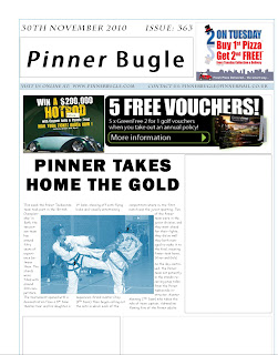
 This is a practise attempt for my local newspaper, it was just an example of what I had learned from my research on codes and conventions.
