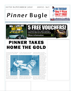
 This is a practise attempt for my local newspaper, it was just an example of what I had learned from my research on codes and conventions.
 I used ads already in existence as a quick filler for my gaps as I will design them later.
The text wrapping around my picture ruins the layout of my text but I will use a better picture and have the picture more to the right of the column.
I feel the layout matches the basic codes and conventions and this will be the formatting I plan to use future drafts of my newspaper.
When you have rearranged the text it will look better. Did you try recreating this in Adobe Indesign? Don't forget that you cannot use any non-original images.
ReplyDelete