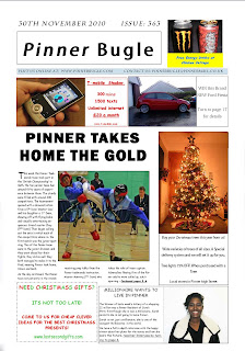
 The First draft of my Print version, I feel I need a corporate identity which I can use throughout all platforms for The Pinner Bugle, I like the layout of the text and advertisements, and it has a simple appealing appearance and looks similar to other local newspaper I have analysed, after showing this First draft to some of my friends the majority agreed the title lets the product down.
Wednesday, 15 December 2010
First Draft of Print Version
 The First draft of my Print version, I feel I need a corporate identity which I can use throughout all platforms for The Pinner Bugle, I like the layout of the text and advertisements, and it has a simple appealing appearance and looks similar to other local newspaper I have analysed, after showing this First draft to some of my friends the majority agreed the title lets the product down.
Monday, 6 December 2010
Tuesday, 30 November 2010
Practise for my Print Version
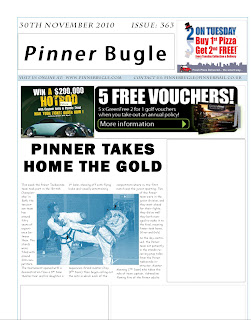 This is a practise attempt for my local newspaper, it was just an example of what I had learned from my research on codes and conventions.
 I used ads already in existence as a quick filler for my gaps as I will design them later.
The text wrapping around my picture ruins the layout of my text but I will use a better picture and have the picture more to the right of the column.
I feel the layout matches the basic codes and conventions and this will be the formatting I plan to use future drafts of my newspaper.
Tuesday, 16 November 2010
Textual analysis of a local newspaper.
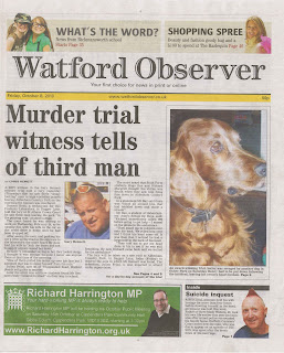
The Harrow Observer local newspaper follows many of the codes and conventions of typical local newspapers, for example the title spans across the length of the page, is a convention of most newspapers since the title needs to stand out when on the shelf visible for the market to see. The strap line has the date and price of the newspaper two things the buyer would want to know about the paper, it also has the newspapers website on the strap line to link the print version and the web version.
The columns in the Watford Observer seem poorly done, as two of the columns are split by the awkwardly placed picture, the header of the story is set to the left and would look much more pleasing if it were set in the middle above the story, the caption is also set to the left and would be a lot better centred under the picture. There is a rule of thirds with the two columns and the dog slightly broken by the picture of the man.
The picture of the dog is strangely larger than the other three pictures of men, implying the dog is more important than a man who committed suicide; the suicide story is in such a small box in the bottom right it would be easy to miss and isn’t portrayed as anything too serious, even though he lost his life. The Photoshop cut out of the man’s head is very poor as you can see excess lines around his hair which were not cropped: the picture of the dog also has its nose
cropped out from view, so it looks poorly framed on the page.
At the bottom left there is an advert for a local MP, the advert relates to people in the local area of Watford, as they may know him or of him, this helps the reader feel more connected to the community. At the top of the paper there are two puffs one saying ‘what’s new from Rickmansworth School’ this would apply to all of the parents of any children going to that school, reaching out to different areas of the community, it would also apply to anyone looking for a good school for their kids. The other puff is about a shopping spree in the ‘Harlequin’ a popular shopping centre in Watford; this applies to anyone who goes to the harlequin.
The Watford Observer has poor production values as it does not make that much money, the layout and design seems low quality and not thought through, the images are poorly framed and badly placed. But the stories do relate to Watford and could gain some attention from its local target market. It follows the basic codes and conventions of a newspaper but does this poorly; in summary the Watford observer looks like a cheap and fast made local newspaper with some stories relation to its target market. In terms of uses and gratifications, it is clear that that the community receives what they wanted from the Watford Observer.
Tuesday, 2 November 2010
Plan of Promotional Poster
 This is my Plan for my promotional poster, the aim is to attract everyone by having everyone in the scene holding a newspaper, and to have unlikely people reading it, the person on the bench is intended to be a child, the prisoner is a very unlikely character. but i feel this would be a simple and funny way of attracting a wide target market. the scene could be taken in a local park in pinner to add to the local feel.
Monday, 18 October 2010
Testing fonts for my Newspaper
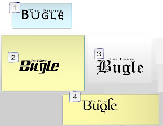
1. Font number 1 is AvQest it is modern and eye pleasing. I asked some friends there opinion and My feedback was that this font would not suit a newspaper.
2. Font number 2 is sandoval it has a nice appearance but is not very professional. My feedback on this font was that it would look very out of place on a newspaper.
3. Font number 3 is Cloister Black it is a classic newspaper font and would be perfect for a newspaper. My feedback was that it would suit a newspaper but would not look appealing and is old fashioned.
4. Font number 4 is Scripticali a very eye appealing classy font a modern approach. My feedback was that it would suit a newspaper and would feel modern.
I will use font 4 Scripticali as my newspapers font, as it is the most modern style and i would like to break away from the stereotype of newspapers being boring old fashioned, with this font i feel it would help me to widen my target market. Giving my Newspaper a modern look.
My Proposal
For my local newspaper I intended to use the title ‘The Pinner Bugle’ in a font similar to sans serif, the colours I plan to use on my front cover are a dark blue as my main colour and either a dull yellow or purple.
For advertising I am going to use a local pizza, a car rental and similar small local businesses around Pinner. I will photograph their products or buildings and keep their adverts small to use a small text.
It will be sold at 50p as that was what my questionnaire proved to be the general conclusion on ‘how much they would spend on a local newspaper’ my newspaper will be aimed at everyone in Pinner from all ages and genders, by showing people from all ages from the community in the local newspaper.
My ideas for my main articles are, the new over-ground line trains and how Pinner enjoys the new comfortable ride, I can take pictures of inside and outside of the train and the train map, I will do some research on how long the trains have been running past and present, I will research people’s opinions on the new trains, by doing all of this I will gather a suitable story showing a brief history the trains and some images of the new trains and a general consensus of the local people’s opinions.
Another idea I have is for a Taekwondo British Championship which is taking place in November, and the Pinner taekwondo team is competing, since last year they won 5 gold medals this is a good opportunity for a community achievement story, I will take a team photograph, and some photos of some of the team competing. I will write about how they have done previously, an interview with the team manager, with this I can have a sporting achievement story, which would relate to teenagers who may have friends competing, or the older generation who are glad to see teenagers doing something for the community.
My other idea for a story is remembrance parade and how an air cadet squadron from Pinner is taking part in the march past the laying of the wreath and an officer’s salute, this would make a very nice story showing how some teenagers can use their time to more productive useful things than the stereotypical ASBO teenager. I can take a picture of the squadron in various different stages of the March past and salute. I can ask some of the people who will see the display what they thought of the display.
My first edition intends to be very positive toward the community to give a good impression of Pinner when you read it, and to develop a rapport with the audience, I will do this by using a positive representation of Pinner by displaying the advancing in the community and the success of good people in the area.
For my local newspapers website I intend to use the same stories from the print copy, I plan on keeping the adverts only on the left to keep them from interfering with any of the text, I will have video interviews from the taekwondo tournament and the train story on the site to add to the interactivity, a slideshow of the photos from the different events, the website should be very interactive and do much more than the print version , hopefully making people come back more and more, the website will be a no fee subscription service, meaning all money will come from advertising/ donations, this is because my questionnaires general conclusion for ‘would you pay for a digital version of your local newspaper’ was a no, a free subscription would be best as I could push notifications via email or mobile about the week’s issue being available increasing chances of receiving hits greatly.
Subscribe to:
Comments (Atom)